[N.B. Click on images to see them full size.]
“God is in the details,” an old proverb opined. But along the way, someone else took his place. “The devil’s in the details” is how the saying goes these days. And if that’s the case, please allow me to introduce myself … because truly for the past two years the details are where I’ve lived.
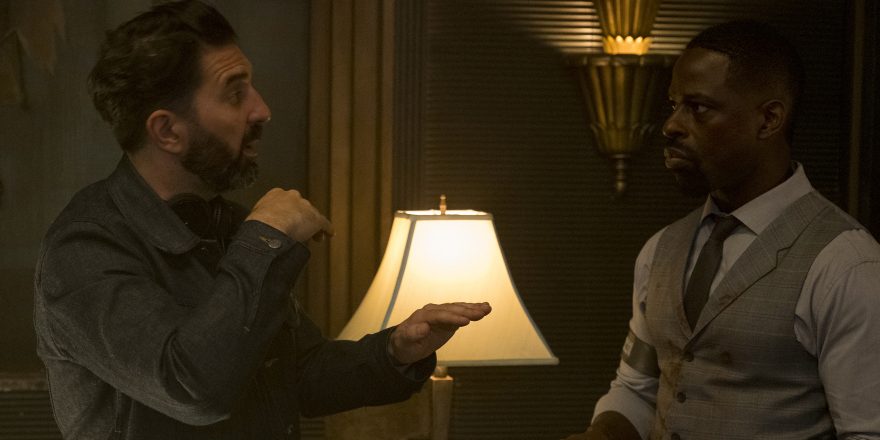
That’s because I just made my first movie – although I’ve worked as a screenwriter on some big motion pictures that you’ve definitely seen on planes through a red-wine-and-Klonopin fug, Hotel Artemis is my debut as a writer-director. It’s the story of an elderly woman (played by Jodie Foster) who runs a secret hospital for criminals in riot-torn near-future Los Angeles. It stars every great actor you’ve ever heard of, from Sterling K. Brown to Jeff Goldblum, and I made it as an indie because I wanted to be able to control the tone – to make sure, for good or for bad, that it would be a statement of what I hope to do going forward as a filmmaker.
But what’s tricky is that Hotel Artemis is also a giant world-build – a vision of the United States in 2028, with all the tech and dystopia that implies. Sure, the universe is seen through the keyhole of a smaller, more personal story, but what we glimpse of the world has to sell the reality of the whole. You can’t have Jodie Foster bringing her double-Oscar-winning A-game to an emotional scene with multi-award-winning Sterling K. Brown, then squander it because the quality of the world around them punctures the reality.
That’s why the devil’s in the details … because a movie like this can stand or fall on their veracity.
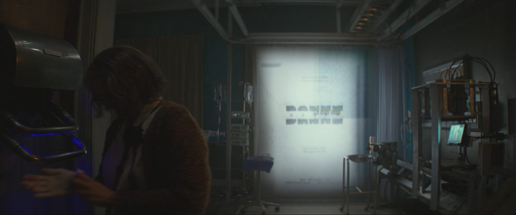
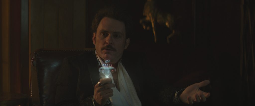
Hence there are 23 different fictional brands in the movie, all with their unique backstory, from DANKO (Russian medical equipment designed for military field use) to AVOCADO (the Bay Area tech company which manufactures the holographic phones that the richer end of the hotel’s clientele use).
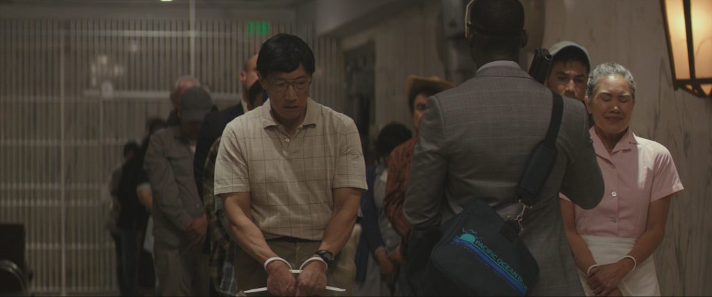
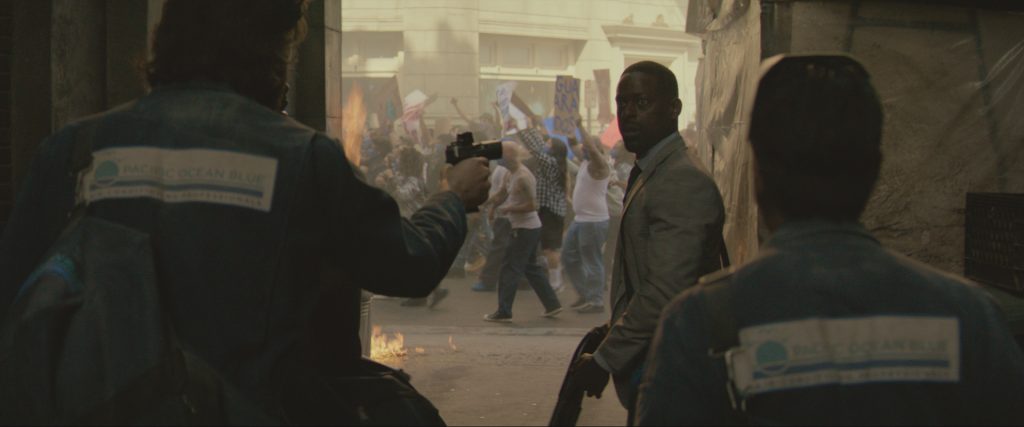
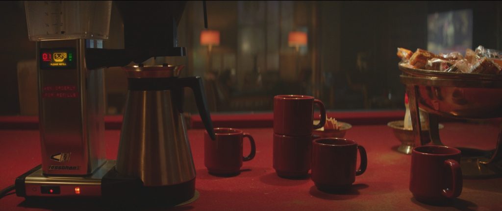
There are also countless references to Californian art from the past hundred years. Bank robbers using a fake company called “Pacific Ocean Blue Air Conditioning” as a cover for their heist work. A polyp spray the Nurse utilizes is called “D1D-ION.” And the attitudinal coffee maker is apparently manufactured by a company called “Less Than Zero.”
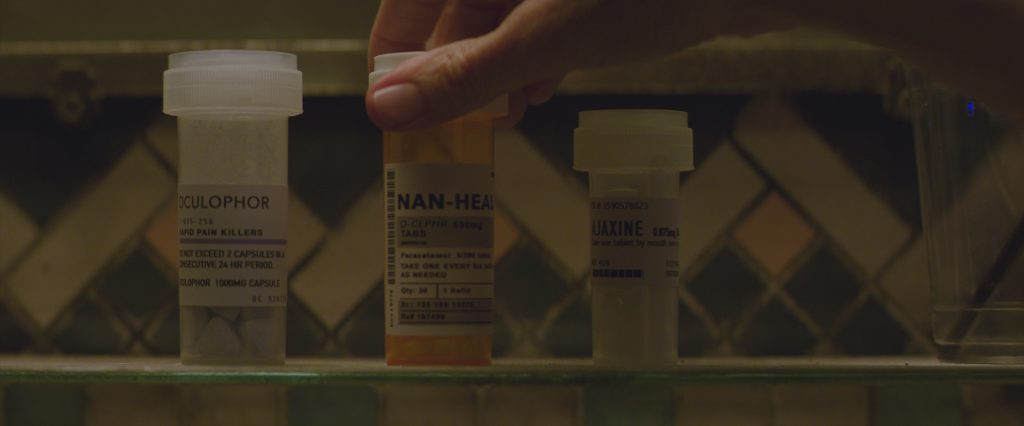
Plus, this being a hospital, there’s all manner of pills and products whose names have to be invented or evolved from currently-available pharmaceuticals.
And honestly, that’s just the beginning.
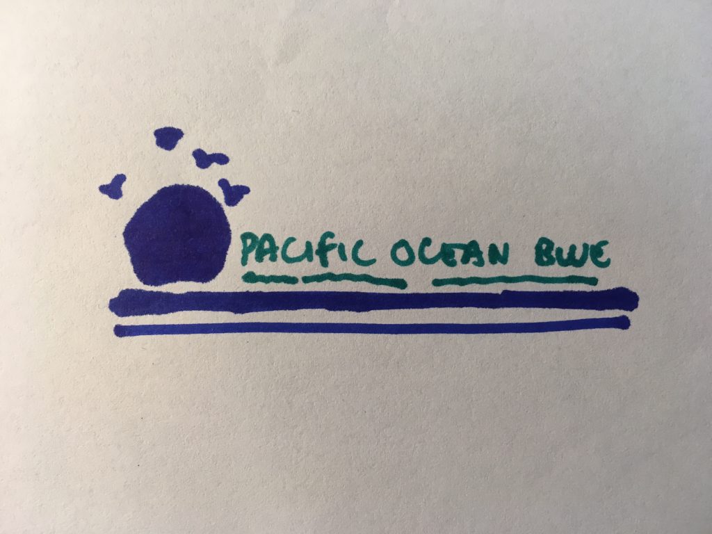
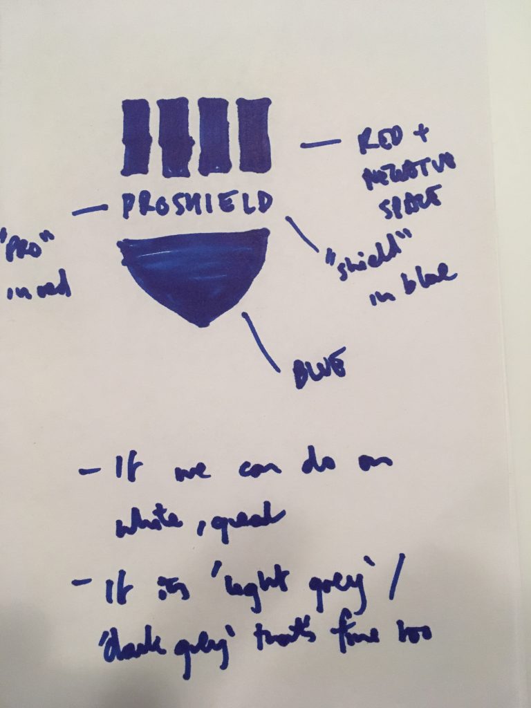
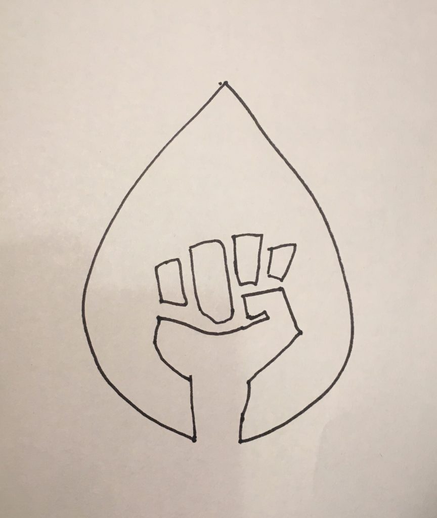
For each of these and more, I took the time to create a world behind each detail. Hell, maybe I took too much time, sketching my own takes on the logos and delivering them to the poor and only-occasionally-resentful design and prop departments, as this Pacific Ocean Blue scribble shows. (Also, it was my sixth attempt.)
But all of this leads to a question: why bother?
Well, the answer is detailed. As I’m sure you’d expect.
First, the prosaic. In movies you have to legally “clear” any pre-existing brands if they appear on screen. And those brands get a little squirrelly when their products are being used for various highly unrecommended reasons by a bunch of criminals.
Hence you have to make something up … so why not put a little thought into it?
Next is simple storytelling – sometimes you just need the audience to understand quickly what a product is so that they pick up on a story beat without you having to use some boring exposition. Hence some details are just simple extrapolations of a modern brand: “Avocado” is clearly a riff on Apple, and the “Choppr” app is clearly meant to signify an airborne Uber. Again, this is just practical.
Then there are the Easter eggs … mostly tributes to your influences. At heart, Easter eggs can be somewhat superficial. Frankly, they sometimes play like the cinematic equivalent of virtue signaling, and they’re a tightrope-walk – you don’t want any reference to be so obvious that it’s distracting, taking the audience out of your fiction.
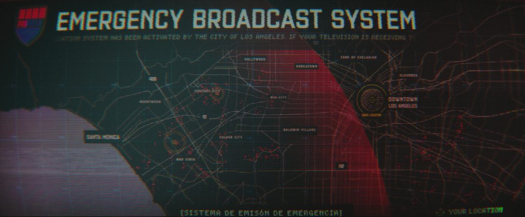
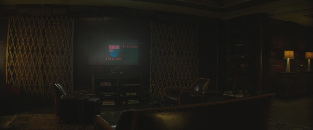
Still, my movie is packed with them. Some are basic – like the fact that ProShield, the privatized police force in our movie, has an insignia that nods towards Judge Dredd’s shield. If you’re British then 2000 AD, the comic Dredd inhabited, is in your pop cultural DNA whether you like it or not, and hence it gets a tip of the hat.
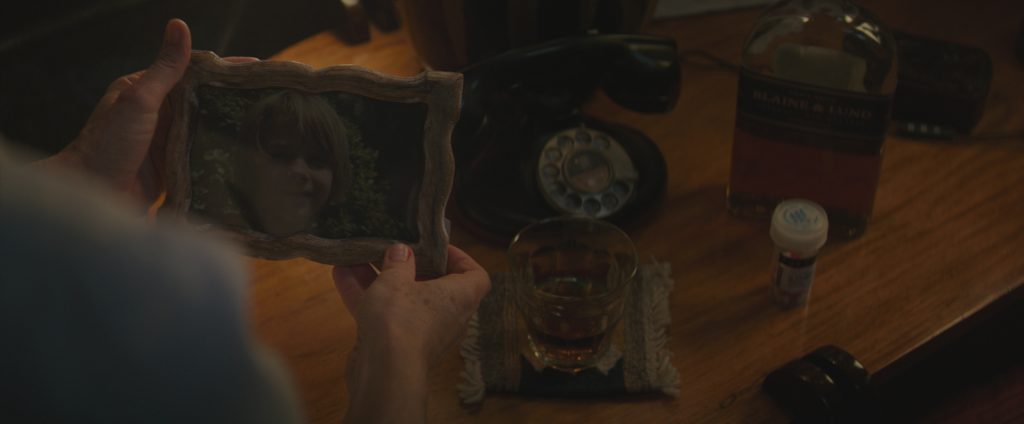
Some are pieces in a game of signifiers you’re playing with the audience, and perhaps a foreshadowing. The brand of whiskey that the Nurse drinks in our film, for example, is called Blaine & Lund, because Casablanca is a big influence on the movie, and on the outcomes of certain relationships in the film.
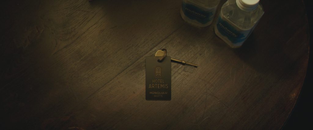
And sometimes these “tributes” can even take on a greater set of meanings. Hotel Artemis is set against the backdrop of water privatization in Los Angeles. The water bottle brand we see around the hospital is “Mulwray” – named for the fictional version of William Mullholland, the man who brought water to Los Angeles, that appears in Chinatown. And we’re a movie that’s aesthetically about the beginnings of L.A., but also maybe its end. So the bookend symmetry of that reference, and even the idea we might be in the same universe as that movie, felt too delicious to pass up.
And yet … even that’s not my whole story when it comes to detail.
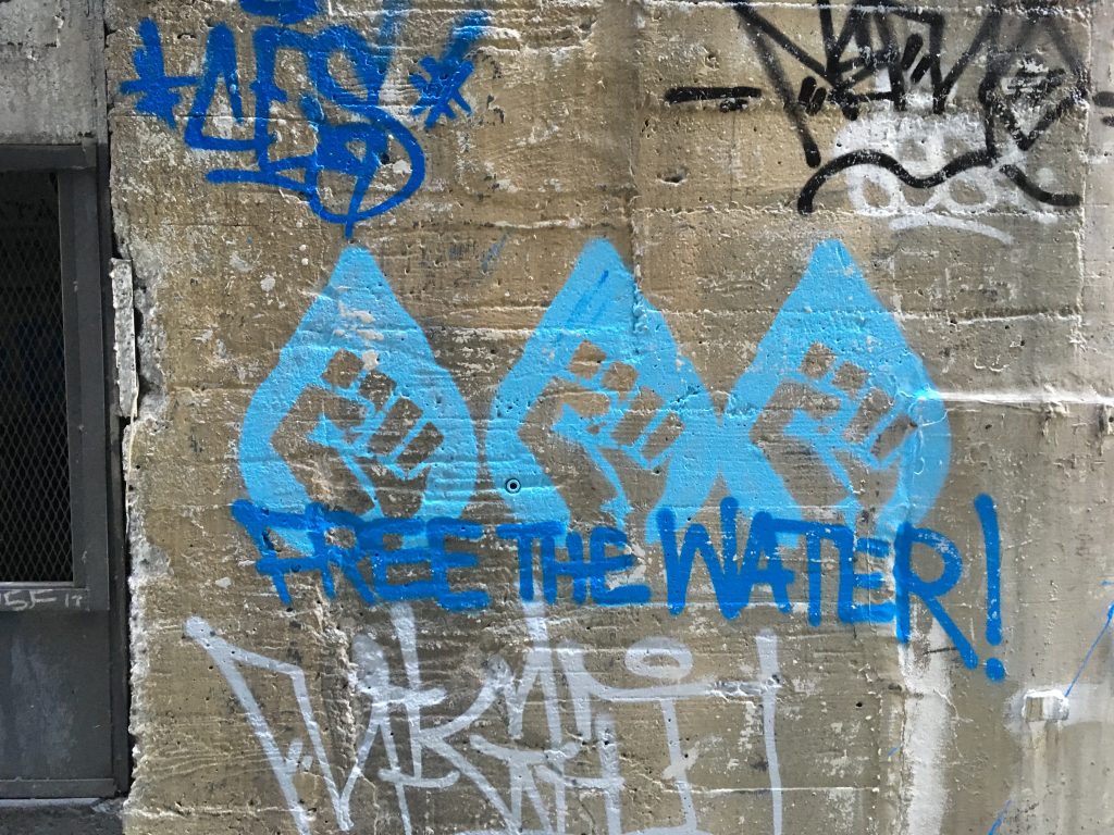
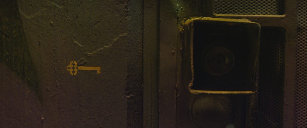
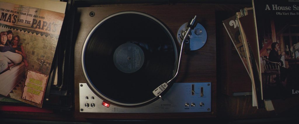
There’s something else that I believe it provides … something that’s less obvious, and more about the soul of the movie you’re making. It’s why there are precisely sourced records in the Nurse’s bedroom. Why there’s water riot graffiti on every surface of the streets of Los Angeles. Why at every secret entrance to the hospital there’s a small key stencil, sprayed and barely noticeable, in the grand tradition of hobo signals and warchalking.
And I guarantee that the audience won’t see most of them.
But the crew can. And from that, they can tell that you know what you’re doing with this universe, and that you’re not phoning it in. You’re only going to direct one movie every two years if you’re lucky – but they’re going to work on seven. Anything that makes it feel more special an experience is important, and that gets baked into the movie itself.
The actors can tell too. Especially when they care about the credibility of their character. Jodie has been acting for 52 years, but even she was surprised by the stories behind the records in her character’s room, and that each of the drugs on the shelves of her hospital rooms had intention and purpose, ratified by our medical consultant. All of it helped her feel settled in the skin of a character that is a world away from who Jodie really is.
It might be wishful thinking, but I believe these details are something that the audience picks up on as well – that I pick up on when I let myself be consumed by a cinematic world. The audience can feel a level of detail that’s not just a clearable fake brand prop rented from some warehouse that they’ve seen countless times. Maybe they don’t know why that’s important. But something in our snake-brains still picks up the handmade quality. It’s the same with any great production design – our brains sense how well a wall has been aged and adjusts its acceptance of the reality you’ve created accordingly.
In our increasingly homogenized corner of existence and art, for my money, every one of these details was worth every second of time we spent on them (and every drop of patience my incredible production designer Ramsey Avery and props master Josh Roth and their teams spent developing them). And maybe in the end that comes down to one overarching reason …
Details tell you that someone cared about this thing they made. And because of those details, maybe it’s worth taking the time to see if you might care about it too.


