I find myself referencing 2003’s The Five Obstructions more than most other films. It’s a documentary hybrid about a director, Jørgen Leth, who has been tasked to remake one of his old short films five times, each with a different restriction bestowed upon him by Lars von Trier. For the first remake, for instance, every shot has to be less than 12 frames. For another, Leth must remake it as a cartoon.
My favorite scene is when von Trier, disappointed in Leth for not adhering to his obstructions strictly enough, punishes him by saying that his next remake will have zero restrictions. Leth is distressed; the absence of constraints paralyzes him. For me, the main takeaway from this experiment (and also from von Trier’s Dogme 95 movement) is that limitations are what help creativity to flourish.
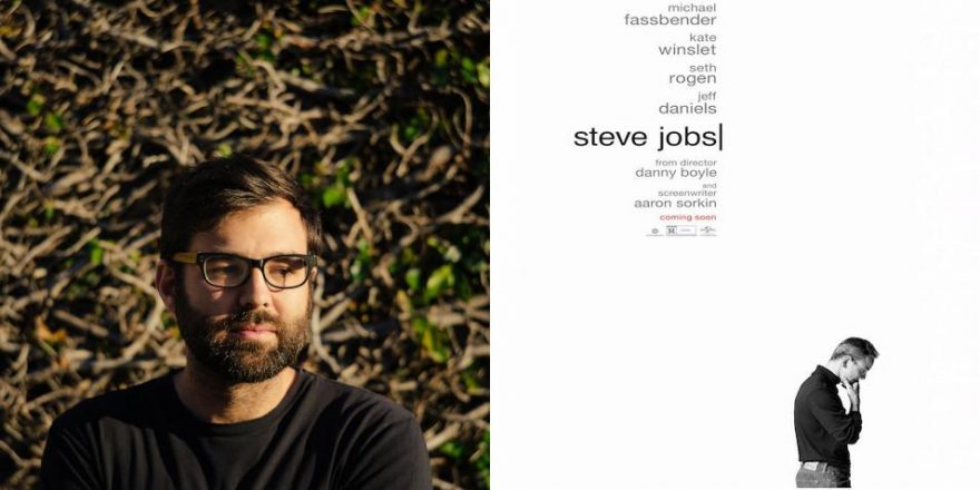
The movie Steve Jobs has a very tricky obstruction as its conceit — the whole movie is told in just three sequences, each depicting the pivotal period just before the launch of a new Apple product. In its best moments, it brings to mind screenwriter Aaron Sorkin’s stellar work in the pilot for Studio 60 on the Sunset Strip, with frenzied walk-and-talk sequences amidst the chaos of a behind-the-scenes production. Character traits are introduced effortlessly within a thick blanket of natural tension.
In the first third of the film, I really appreciated this approach. To me, biopics all too often feel like a compilation of “best of” moments rather than a cohesive story, with some kind of reductive armchair psychological assessment of the main character interpreted from said events. (Man on the Moon is perhaps the most tragic example of this.) Early on, I found myself forgiving the film for being forced to sandwich all sorts of backstory within this conceit because of how original it was. I appreciated Boyle’s restraint, letting many important emotional beats transpire in medium shots.
To me, biopics all too often feel like a compilation of “best of” moments rather than a cohesive story.But eventually this constraint ended up being just too constricting, which perhaps forced Boyle to then overcompensate with his direction, throwing bells and whistles into moments that didn’t need them. I absolutely love Boyle’s early work; Shallow Grave (which I owned on VHS), Trainspotting and 28 Days Later are films I revisit frequently. And so it’s been personally disappointing in more recent years that he’s chosen to employ a more frenetic style, hosing down scenes with heaps of unspecific coverage, shooting from every angle, and waiting to make his decisions in the editing room. The script for Steve Jobs could easily have been turned into a stageplay, and perhaps Boyle was chosen as a director because of how “visual” he is. But his efforts to distract eventually call attention to what is lacking.
As the film goes along, rather than having the confidence to let Sorkin’s dialogue do all of the work in the scenes, Boyle makes some occasional oddball directorial choices that are dolloped onto the screen. There’s one moment in particular early on, in the middle of a conversation about a song, in which he cuts to a very high-angle shot (uncharacteristic within the visual design thus far) and a graphic of a song lyric pops up, as if the words have been projected onto the floor of the set. Up until then, I was totally sucked into the world of the movie, but here it was as if Boyle himself had popped up on screen and said, “Hey, look, look, look — I just did a thing!”
It happens throughout; later on, stock footage of a rocket is made to look as if it’s projected on the walls of the set. Flashbacks are introduced, one of which is shot with dramatic contrast ratios and Dutch angles, bringing to mind Fincher’s music video work from the ’90s. With each, I was taken out of the film. In these moments, it felt to me like the director had put his own importance above his story.
Going back to Trainspotting, what I love about that film is that the subjective use of style is often motivated by the characters’ drug-induced states. For instance, when we go on the underwater journey through the “worst toilet in Scotland,” we’re so firmly in Renton’s head — Boyle uses this departure from reality to bring the audience even closer to his character. It’s imaginative, it’s baked into the story, but, more importantly, it’s cohesive.
This is what gets me off. Sure, I like directors who stay completely out of the way and do very little with their camera. However, I love directors who can just add that little something-something and enhance the audience’s experience unselfconsciously. One could make an argument that there’s something more subversive going on here, that because we’re watching the story of a very ego-driven and flawed man, the style itself is intentionally flawed. But I think this assessment is false.
The disjointed approach in Steve Jobs even extends to the music, which early on subtly thump-thump-thumps its way along, only serving to invisibly enhance the fantastic work of the actors and build tension. As the film goes along, though, the music eventually gets Very Dramatic, rather than letting the scenes themselves do that work for us. That said, even without music, I think the film’s narrative restrictions eventually result in unearned moments. Perhaps the most important subplot involves Jobs’ reluctant relationship with his daughter, and in the third sequence, the way he mends this relationship is devoid of the complexity that the film promises at the beginning. But it’s even more egregious when a song by the Maccabees confidently declares what giant simplistic emotions we’re supposed to be feeling. As the acting in this film is so superb, this feels like a cardinal sin. And again, just not cohesive.
So, even though the construct of Sorkin’s script has this unique and challenging obstruction, in my opinion, the principles that govern Boyle’s own cinematic design could have perhaps benefited from one.


