Though there’s been a general point of thought – even today in the golden age of TV – that the medium of Television cannot achieve the level of scope, atmosphere, mood and style that a feature film can, the lines between “Cinema” and “Television” blur more and more every day. Since HBO changed the game with series like The Sopranos, Oz, Six Feet Under and The Wire, every show wanted to look slick and have some of the same visual style as their cinematic counterparts. Bigger landscapes! Longer Steadicam shots! More intricate CG shots traveling through bullet wounds! Feature directors who have muscular, “Hollywood-friendly” styles such as Jon Favreau, Neil Marshall and David Slade began to migrate to television for the opportunity to develop a style for a show, to add scope and visual flare, to bolster a look that could even confuse the viewer into thinking what they were watching on their huge 60-inch High Def screens could have opened on 2000 screens. And with the changing tides of distribution further blurring the lines of how someone can watch 1-2 hours of content, the need to create something eye-catching has never been greater.
I’ve been a fan of (fellow Talkhouse Film contributor) Bret Easton Ellis’ since Less Than Zero incinerated my young brain in the late ’80s; his elegant, decadent, clever stories about jaded youth, Oingo Boingo, celebrities, chainsaws and Mr. Chow were always fascinating to an outsider like me. On Bret’s excellent podcast, one point that repeatedly comes up is the topic of Film vs. TV, with Bret stating that TV’s form has not – and possibly never will – achieve the same level of visual panache, the same kinds of compositions, atmospheres, that Cinema has been able to harness. I’m paraphrasing here, but in Ellis’ eyes, movies hold some form of alchemy that TV has not been able to conjure; the allowance to take bolder strokes with the camera, the lighting, the overall cinematic scope and atmosphere, achieving a more cinematically sumptuous experience as opposed to TV which is usually focused on plot and character than mood and visual tone.
…Which is why I wonder if Bret has watched Sam Esmail’s Mr. Robot yet.
And if not, then this is my pitch to one of my favorite writers, because Mr. Robot not only holds its own as a compelling, modern anti-capitalist thriller, but uses a unique visual approach that might seem off-putting, yet envelops the viewer in a style that is fitting as well as being a subjective peek into the mind of its protagonist (Or is it antagonist?). If anything, Mr. Robot could be the best Bret Easton Ellis TV show he has nothing to do with.
I don’t need to go into the setup or plot of Mr. Robot; I’d prefer you to go into the show as blind as I did. All I knew was, “Hacker with shifty eyes is embroiled in a conspiracy to take down a major corporation from within as he battles demons around him, as well as inside him,” and a handful of reviews that called it a “revelation,” or “like nothing you’ve seen before.” OK sure, heard those before. And these days most dramas follow [INSERT FRACTURED, DAMAGED EVERYPERSON] as they go about their day as a [INSERT KOOKY CAREER CHOICE HERE] as the screws turn. In the age of Breaking Bad, Mad Men and Dexter, it’s not hard to imagine a show about a hacker and his double life, though it’s possibly a little shocking that it would be on a usually family-centric channel like USA.
What immediately struck me about Mr. Robot from just the first few moments of the pilot was how the show was shot. Characters were framed in the lower quadrant of the image, talking to someone off-camera, but their eye-lines (where their eyes are facing so the audience knows through familiar cinema language who they are talking to) are slightly off. Actually, almost everything in the way the show is helmed is a little “off”; the framing and pacing of moments have a strange, almost surreal feel, as if we’re in a dream. Since askew angles and such are in most cases utilized to announce or imply another state of being, like a dream or a hallucination, these frames add to the paranoia of the characters but also of the audience, as nothing can be trusted to be what it seems.
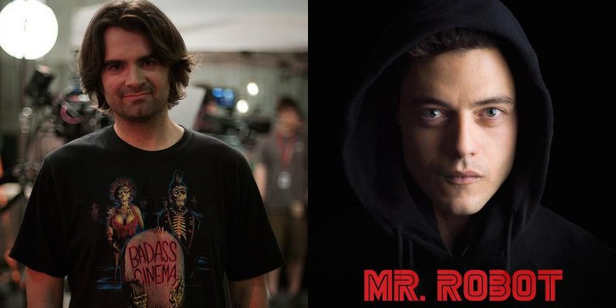
At first, I came to the conclusion that Mr. Robot’s scripts were shot this way just to be different, just to harness that David Fincher-esque “cool” style so as to get a little attention in the sea of TV shows flooding our DVRs and streaming queues. Now having completed the first season, I feel there is so much more to that conceit, that we as an audience needed to catch up to our hacker Elliot (Rami Malek) and his quest to discover who Mr. Robot is (and how he himself plays a part in a larger game that could impact our society). In Mr. Robot, like the best Fincher films, the camera affords us a subjective peek into the mind of the mentally unbalanced, and the placement of the camera is actually a clue into the secrets behind the show.
We see the tics in his head, the flickers of alter egos, the way the frame begins to shake and implode when he’s breaking down.Esmail’s show immediately allows the audience to know we’re in a subjective space, as Elliot speaks in voiceover throughout, constantly referring to “You.” Does he mean the royal “You,” where it’s just a blanket description of the world? Is he talking to himself as “you?” Elliot works at a company subcontracted to E Corp, which he nicknames “Evil Corp” as a dig against the corporate sharks who are putting the people of our world in a capitalist stranglehold. Yet, in the course of the first episode and over the whole season, everyone in the show begins to call it Evil Corp. It took me a few moments to acclimate to this, but it was a subtle way to allow the audience to realize we could be seeing everything through Elliot’s POV. It was a clever device, one that wasn’t shoved down our throats like most TV pilots that need to bombard the audience with all the plots, instead trusting us to gradually fall inside the head of this (possibly insane) young man.
But back to those shots…
Again, I’m not gonna get into spoiler territory here, because for me one of the joys of experiencing the show was how little I knew of where it was going to go. The mention of Fincher’s earlier works brings to mind that Mr. Robot is somewhat the spiritual heir to the director’s seminal cult favorite Fight Club, with its dark olive-color palette, odd electronic score, use of The Pixies’ “Where is My Mind?” (even if it was a cover) and, most resonantly, a very unreliable narrator obsessed with anarchy who seems to be in sync with how the story unfolds visually. We see the tics in his head, the flickers of alter egos, the way the frame begins to shake and implode when he’s breaking down. Fincher’s camera and Jack/Tyler are connected at the hip, and Mr. Robot employs the same techniques that on TV feel fresh, hence the stir the show created this summer with critics and audiences alike. It’s like Esmail “ported” the feel of Fight Club and The Game to a smaller format than the silver screen, and not just to ape a cool style.
But how the show’s visual formula illustrates the world of the show (and possibly Elliot’s fractured brainpan) is its greatest trick. As mentioned before, Mr. Robot unconventionally frames normal conversations, with the speaker oddly off at the edge of the frame, low in the mise-en-scène where “head room” is large and looming. Everyone in the resulting frame looks small, miniscule in the world, which perfectly sets the stage for characters who are trying to rise up against Evil Corp. Very rarely are any two characters in a conversation even in the same frame; instead characters are shown alone in the shot as they speak or react, further hammering the idea of isolation and lack of connection with others in the age of social networking and smartphone dinner conversations.
One could even see these deliberately malformed compositions as the personification of Mr. Robot and the omnipresent “eye” of technology, how a computer might not really be able to deduce what mise-en-scène or a well-composed frame is. Even further, since the show deals with the internal processes of many of its characters – leaving moments of awkward pauses and thoughtful beats with just the characters staring, thinking – it’s as if these frames are leaving space for thought bubbles. By keeping our characters in the lower quadrant, it forces our eye elsewhere in the frame, making us work and not just let dialogue and exposition wash over us. The style grabs our attention by the throat.
Because…what really is a “well-composed frame”? With cinema being a subjective art form, what’s a “perfect shot” to one viewer may induce groans in another, a phenomenon observed with Wes Anderson’s very symmetrical style. Many dig it, some don’t; that’s the beauty of the visual medium and all art, really. You’re both right and wrong. Movies have created a language that TV has been trying to emulate forever. Now that technology, budgets and demand for more cinematic TV is at an all-time high, Mr. Robot destroys that conception by deliberately going rogue and not framing it like most movies would, rejecting the current wisdom of how to ensure success in the field. We champion filmmakers who rage against the machine of conventional populist art, much like how Elliot is fighting to “free society” from its own constraints. So again, the show’s visual formula personifies its character’s worldview.
Most master shots in the show also have a framing that feels almost like a security camera’s, as we peer into this world that Esmail has created. Everyone in Mr. Robot is being observed, and in all these establishing shots in boardrooms, apartments, old arcades, it feels like they (Or is it “we”?) are watching. And the further you go down the Mr. Robot hole, the more you’ll see how true that is. It should also be noted that the show is produced and shot in New York City, a character in and of itself. Using its skewed style to show the streets of the greatest city on Earth, which we’ve seen at its best and seediest, subliminally adds to the scope of the show while subverting it with its fractured frame.
There are even a few moments in Mr. Robot where Elliot “spikes” the camera (looks right in the lens). These scenes really struck me, especially later in the show, when our perception of who Elliot and those around him really are is radically shifting. His precarious mental state allows us to actually think there are moments when he is looking at us, and thanks to the fractured framing and subjective, “techno-punk” visual style, there were times when I got a chill watching actor Malek stare down the camera as if… Can he see me?! A simple technique that’s used often, but here it’s utterly spellbinding.
Mr. Robot feels like Television 2.0, where the lines between what can be considered “Cinema style” and “TV style” are crumbling. Its visual strategy is strange, its point-of-view as compellingly unreliable as a mental patient working the front desk of the hospital, yet it’s the closest thing to a 10-hour movie on television right now, and hell if the show doesn’t make you work your brain. It’s not passive entertainment and if you’re on a laptop or a phone while watching…well, then you’re part of the problem it’s addressing and you’re missing out on what is one of the most interesting stories unfolding today.
I hope you dig it, Bret, and see the future. We’re still gonna go to the movies, but I think there may be room for a little Robot in your life to satisfy your cinema cravings.


