When I decided to write a robot into my script about a young girl living with her parents on the hostile fringes of a colonized Mars, I naively thought we could get away with something akin to a modified remote-control car. Think Comedy Central’s BattleBots from the 2000s. In other words, this was my first time trying anything like this.
In sixth grade, I took an A/V class on a whim. The first day, the teacher had us all come up with a pitch for a short film; whichever received the most votes from the other students would be the one we’d make. I pitched a bug monster terrorizing the school hallways (my English teacher was the first victim). It won the most votes and I was named the director. However, with the budget constraints of a middle-school classroom, creating the monster presented an obstacle. The solution, naturally, was never to show it. Instead, we only saw what it saw, à la Jaws, but in black-and-white and with buzzing noises.
I was hooked. On movies, yes, but also moviemaking, the process of coming up with ways to bring to the screen things that exist only in your head. I obsessed over the behind-the-scenes books and featurettes of Industrial Light & Magic and Weta Workshop, marveling at the early prototypes and concept sketches for characters and worlds whose final forms had until then seemed only natural. My next short — shot (and edited!) with my dad’s Hi8 camera, about Navy SEALS repelling an alien invasion — featured a close-up of a toy Millennium Falcon landing through the mist of our neighbor’s fog machine, and a sliding barn door through which the SEAL team jumped from their “helicopter.” The SEALs themselves, played by my younger brother and obliging friends, were armed with laser-tag sets and cap guns that I’d spray-painted black. These guns are still in a drawer in my parents’ house, waiting to creep out the next guests when they unpack.
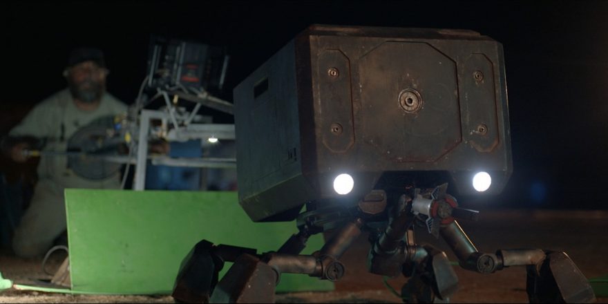
With all of this in mind, you can possibly imagine my delight, years later, when I walked into the workshop of the English company Millennium FX and saw the team hard at work on hundreds of alien heads (for a different movie). By then, my film Settlers was scheduled to shoot later in the year and we were closing in on how to bring the robot, named Steve, to life. We had a budget for visual effects (VFX), but had to use it judiciously. Moreover, I wanted to have the actual creature on set for the actors to work with. The plan, effectively, was to build a puppet for the close-ups and use VFX for the more complex movements.
This joint approach required detailed collaboration from the early stages of the design process between the production designer, the VFX team, creature builders and the lead puppeteer.
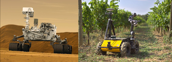
From the outset, I wanted Steve’s design to flow from its basic function. I imagined it as a part of a mass-produced homesteader franchise package, which came complete with a modular home, a greenhouse, and everything a family would need to cultivate their piece of the changing Martian frontier. Steve was a key component of the franchise’s “terraforming” operation, so his function was to break up the barren ground (through a process approximating hydrofracking), lace it with fertile soil and seeds, and ultimately tend to the plant life that emerged. NASA’s Mars rovers, especially Curiosity (effectively a rolling Swiss Army knife), had been early inspirations. So too were the mass-produced agricultural robots back here on Earth:
But I was eager to branch away and draw on the creativity and expertise of the team. They dove into the challenge and we began breaking down all aspects of Steve’s utility, scouring the internet for texture and movement references, and, above all, spit-balling ideas.
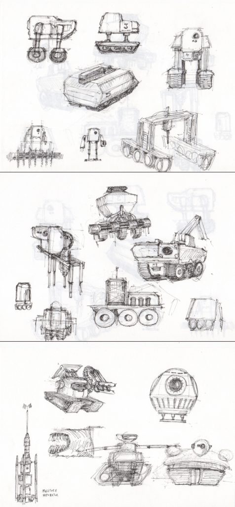
Samples of early concept sketches by production designer Noam Piper:
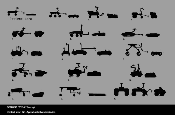
Silhouettes by VFX designer Christian Bull:
Master puppeteer William Todd-Jones (and the foot of line producer James Cotton) with a Steve prototype made from an office lamp and trash bin:

This process yielded several key insights (3D prototypes by Christian Bull):
1. Since Steve would need to be able to maneuver carefully over vulnerable ground, it really should be on legs, as opposed to Mars-rover-style wheels.
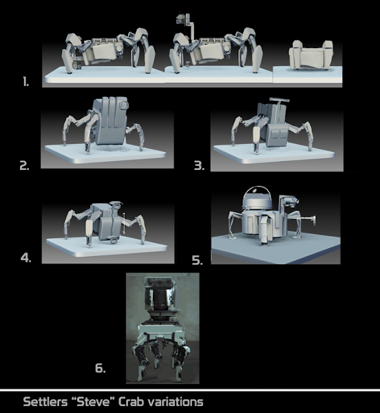
2. To suggest Steve is mass produced, let’s make it stackable, like an apple crate.
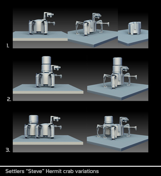
3. Steve is a beast of burden, so put its body and “eyes” close to the ground.
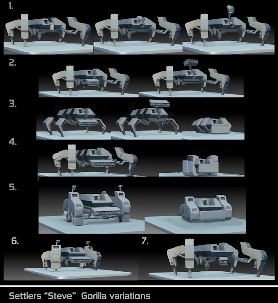
There’s also the following picture. I don’t know how much of an influence this actually had on my thinking but, when my wife went into labor, I took this photo of a birthing ball in the hospital:
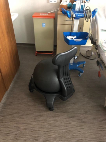
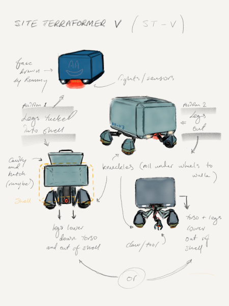
With all this floating around in our heads, I sent the following sketches to the team:
And Christian came back with this:
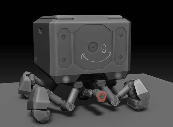
(Note: around this time, we decided that Remmy, the young girl, would draw a smiley face on Steve.)
Though we’d continue to refine the details, we were suddenly looking at Steve. The design was informed by his function, his lines were visually consistent with the modular style we were developing for the overall homestead, and, as a bonus, he was sufficiently distinct from other movie robots audiences may have seen.
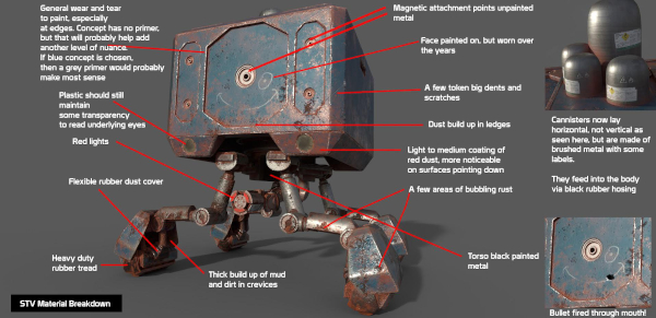
We moved on to texture, opting for a patina that would convey his long life as a workhorse:
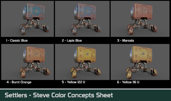
For Steve’s color, we agonized over how far we could push the saturation — to give it a more corporate, mass-produced look — without making it look like a toy (an ever-present anxiety for the director of an independent sci-fi). We chose a blue, only to later flee to a coward’s gray.
And to make sure we were happy with Steve’s proportions relative to his nine-year-old companion, Remmy (too big and it’s intimidating; too small and it’s nipping at her heels), Todd and his kids built a full foam-and-PVC-pipe version over a weekend, as families do.
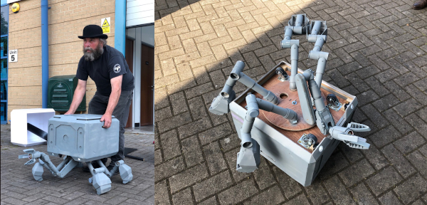
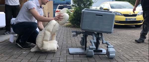
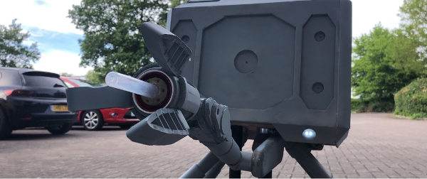
But the most complicated element, by far, was movement. We began by developing a basic physical vocabulary – How quickly can Steve walk? How high are its knees off the ground? How does it fold up? How do the fingers of its claw extend and retract? — and thrilled to the early animation tests from Christian, which I felt captured Steve’s earnest demeanor:
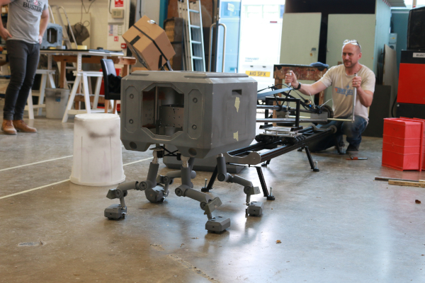
However, this manner and vocabulary had to be achievable and consistent across departments. To accomplish the required range of motion, Kate Walshe and her team at Millennium FX ultimately opted to build several Steve puppets, each one designed for a specific mode of movement and style of shot.
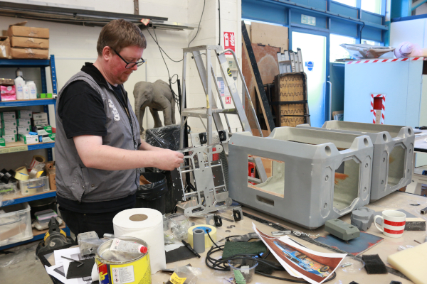
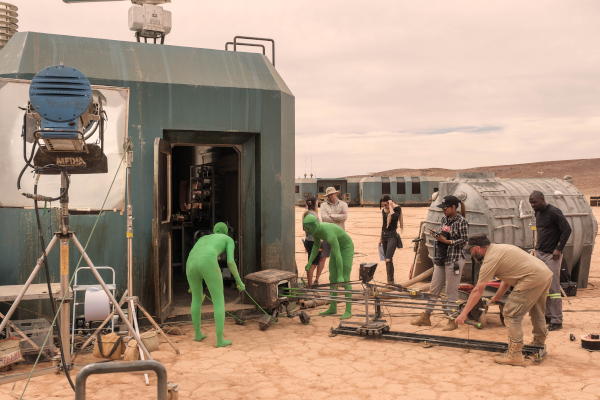
Beyond range and consistency across departments, our focus on movement stemmed from a simple fact: Steve couldn’t talk. The film’s plot hinged on whether Steve was capable of genuine compassion or ultimately was “just a tool,” which meant Steve had to be relatively inscrutable and its means of communication limited. So, talking was out. Even vocalizing was too much for me. Which left only movement to give expression to its thoughts and hint at a personality. Having embodied creatures of every kind over a career reaching back to Jim Henson’s Labyrinth, Todd was no stranger to non-verbal communication and, with his team of green-suited puppeteers, translated Steve’s physicality into a fully-fledged individual struggling to process its conflicting loyalties.

This persona then had to carry over into Steve’s more elaborate movements, which were handled by the VFX artists at Automatik under the supervision of Seb Barker and Jean-Michel Boublil. Consider the evolution of the shot in which we first see Steve pop out of his box. We shot a lighting reference with Steve’s box and then a clean plate to composite over, but the specifics of Steve’s movement were created from scratch by the animator.
In this early pass of the animation, note how Steve transitions from rolling to walking rather seamlessly:
It’s very, well, robotic. But I wanted Steve’s playfulness to be evident right away. So, we added a wobble as it emerges onto its legs. This small adjustment not only connected the animation to the puppet’s performance in the non-VFX shots but also fit the story: at that point, Steve had been stuck in that box for years — naturally it would need a moment to find its balance:
But it doesn’t really come alive until you add the sound. Though Steve can’t vocalize, its body makes all sorts of noises. It’s effectively a piece of used farming equipment, so I wanted to hear the internal effort of each movement — like you would in an old car. Sound designer Dillon Bennett pulled together over a hundred sounds to transform Steve from a lightweight puppet into a piece of heavy, pneumatic machinery from the future. Take a listen to this clip from the finished film:
If there is a moral to this story, it’s that robots come with some assembly required. So, don’t go writing one into a script without thinking it through. But I, for one, am glad I did. The best part of filmmaking is the collaboration, and Steve gave me the chance to spend a lot of time brainstorming with some intensely creative people.
Finally, if anyone out there would like to have Steve, let me know. It’s currently taking up a lot of space in a friend’s barn in Yorkshire.


